


Keep Training and Stay Ahead
Our industry leading apprenticeship programs and post trade training courses
will help you get ahead of the game, and stay there throughout your career.

Apprenticeship Training
The Service Trades College offers a range of flexible, apprenticeship training programs to help you reach your full potential and enjoy a fulfilling career.

Post Trade Qualifications
The Service Trades College offers many post trade qualifications which are developed with our industry partners to ensure your training is cutting edge.
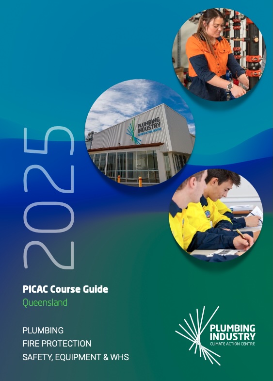
2025 Industry Development Training Schedule and Course Guide
For course enquires at PICAC Beenleigh – please contact info@tstca.com.au or call 1300 222 727
From the Chairman

Gary O’Halloran
Chairman
The Service Trades College
As Chair of our College, I am proud to be part of an organisation which provides a world-class training facility for apprentices – purpose-built by industry for industry. The College is a leader in its field, providing a pathway for apprentices to a 30 year career in the major construction sector – not just a four year apprenticeship. It is a centre of excellence providing the most innovative and up-to-date training methods – both in the classroom and on the job.
The College is a great example of what can be achieved when our industry works together to achieve a common goal. We are proud of the productive relationships we have with our industry partners and their ongoing investment in the future of our College and our apprentices.
Over the next year or so, we will be exploring commercial vocational education and training opportunities nationally. A key focus during the next 12 months will also be researching and adopting new and innovative training techniques and technology to ensure our training remains in step with industry requirements. We have a strong affiliation with the United Associations with the intent to continue to build productive relationships that will strengthen the College as a leader in the industry.
I look forward to another successful year.
News
Your USI
Your USI will help keep your training records and results together in an online account controlled by you.
Each time you enrol to study with a new training organisation, your USI will be used to store your training records and results.
By having a USI you will be able to access your training records and results (or transcript) whenever you need them. For example, for a new employer or when you enrol to study at a new training organisation.
Your USI can be accessed online from your computer, tablet or smart phone and gives you access to your training records and results at your fingertips.
Our Industry Partners

HEALTH and SAFETY
Personal Protective Equipment (PPE) requirements while studying at the College are:
To wear safety gear (long trousers, long sleeves and safety boots) at all times
To wear safety glasses whenever attending a practical assessment / training.